Paratus Institute
Background
Paratus Institute is a first aid training company that has been in business for over fifteen years. Their classes are designed for a niche audience of serious outdoorsmen, as their flagship class, Wilderness First Aid, focuses primarily on how to handle medical emergencies where professional help may be many miles, and hours, away.
Roughly six years ago they reworked their Wilderness First Aid course to include a blended learning experience, mixing an online “lecture” component with an in-person hands-on learning experience, including a series of intensive practical scenario exercises. This gave their students the ability to work at their own pace through the class materials, freeing up the instructors to focus on answering questions and coaching the practical elements. Now, for the first time since its founding, Paratus Institute was looking for a massive overhaul of its consumer facing presence.
Strategy
Paratus’ goals were multi-fold…
The company wanted to establish clear branding and a purposeful visual language, which it had neglected in the past, including the development of a new logo and color scheme.
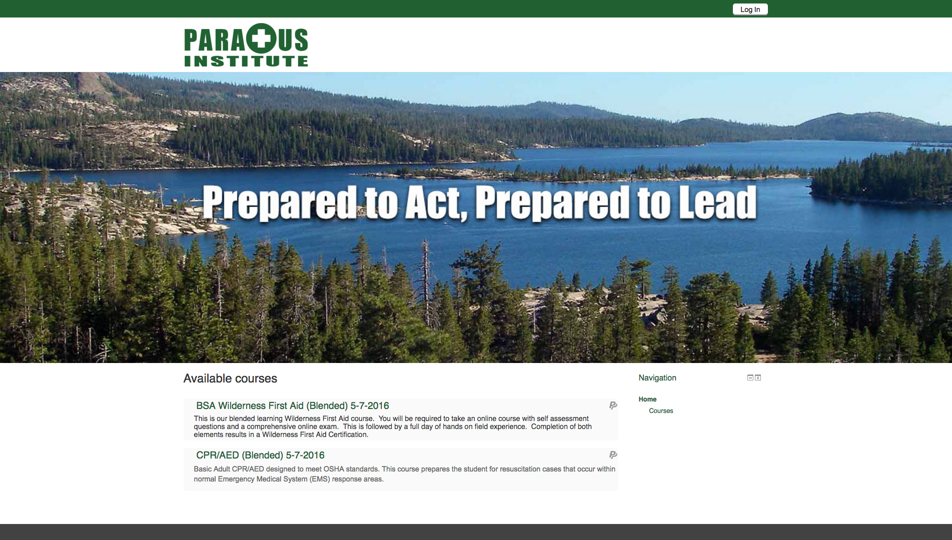
Paratus also wanted to update its online presence and bring the digital aspect of its blended learning into the modern age. Both the company’s website and course materials hadn’t been changed since the transition to a blended learning format. In those six years, a lot had changed in the internet technology space. Firefox 3.0 is now Firefox 44.0. It was important to Paratus Institute that both their website and blended learning tools be brought in line with both modern best practices in web design and the best available web technologies. The largest component of the project was overhauling these two aspects of Paratus Institute’s business.
With such a multi-avenue redesign, the challenge was in finding a unifying idea that would provide direction for every aspect of Paratus’ relaunch. To find that idea, I concentrated on Paratus’ core competitive advantage: it’s e-learning.
At the time that Paratus launched their blended learning solution they were near the cutting edge of technology. While it remains the only first aid training center to offer such classes in Northern California, the larger field of e-learning has caught up to, or surpassed, what Paratus offered. This presented a wealth of knowledge about what worked and what didn’t in the e-learning space.
Combining the feedback from Paratus’ own students with the common complaints of participants in other e-learning outlets, such as online college courses, revealed an aspect of the student experience that Paratus Institute could solve. In essence…
The Insight
The biggest pain point for e-learning participants is the struggles with technology compatibility.
The Idea
Retool every aspect of the Paratus Institute web presence to make their materials available whenever, wherever, and however a student wants.
New Logo
Strong and contemporary, the new logo’s design incorporated two ideas: a forest green to represent the outdoor focus of the company and a green/white cross motif that reflects a worldwide symbol for first aid.
Standard Logo
Inverted Logo
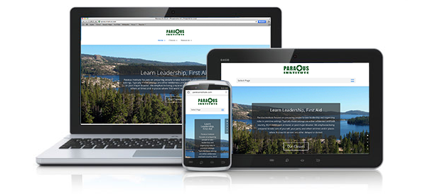
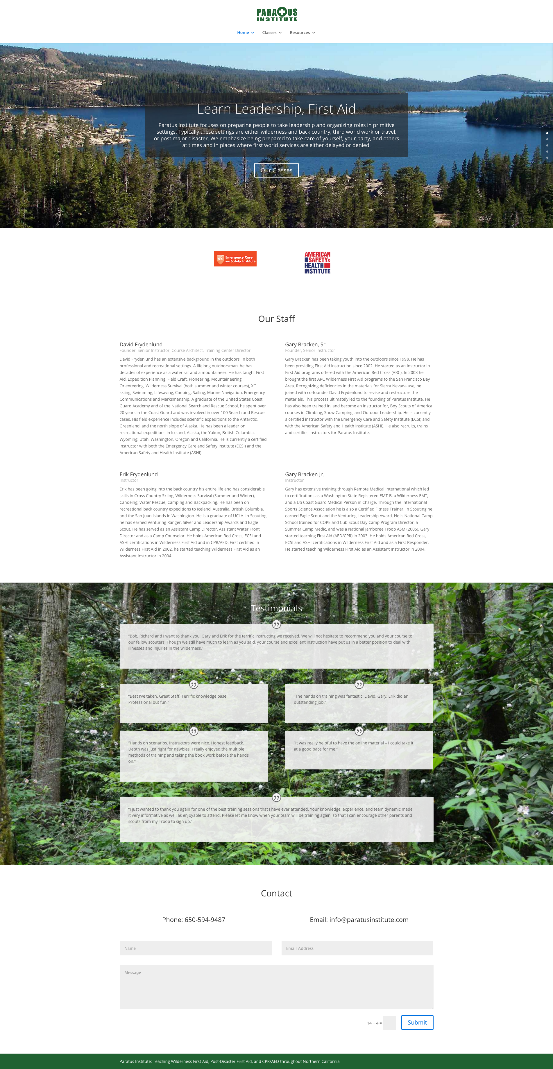
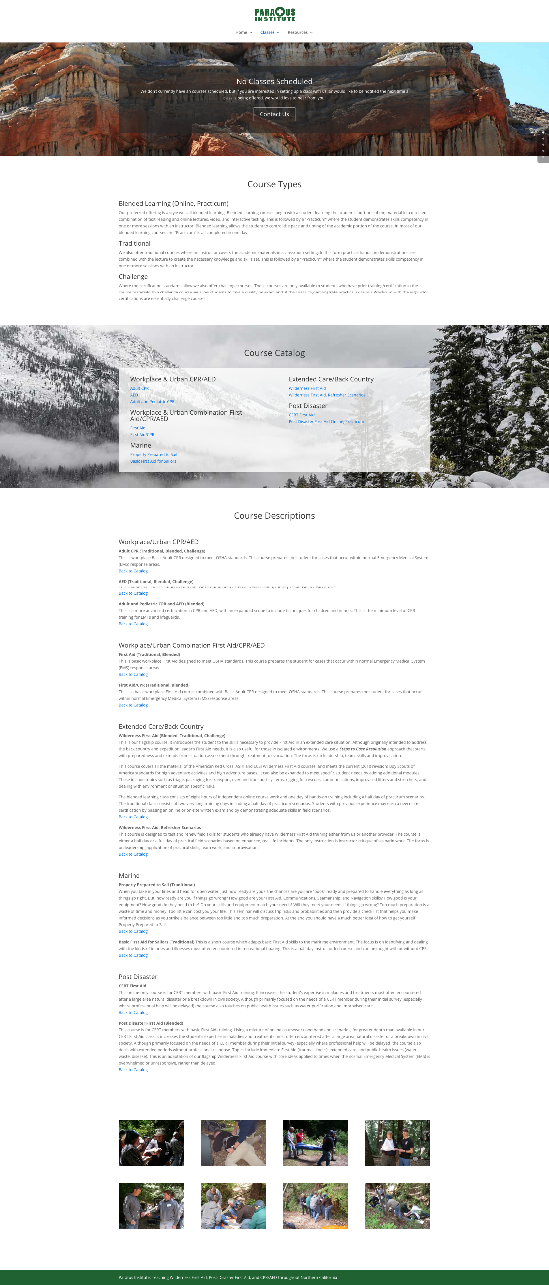
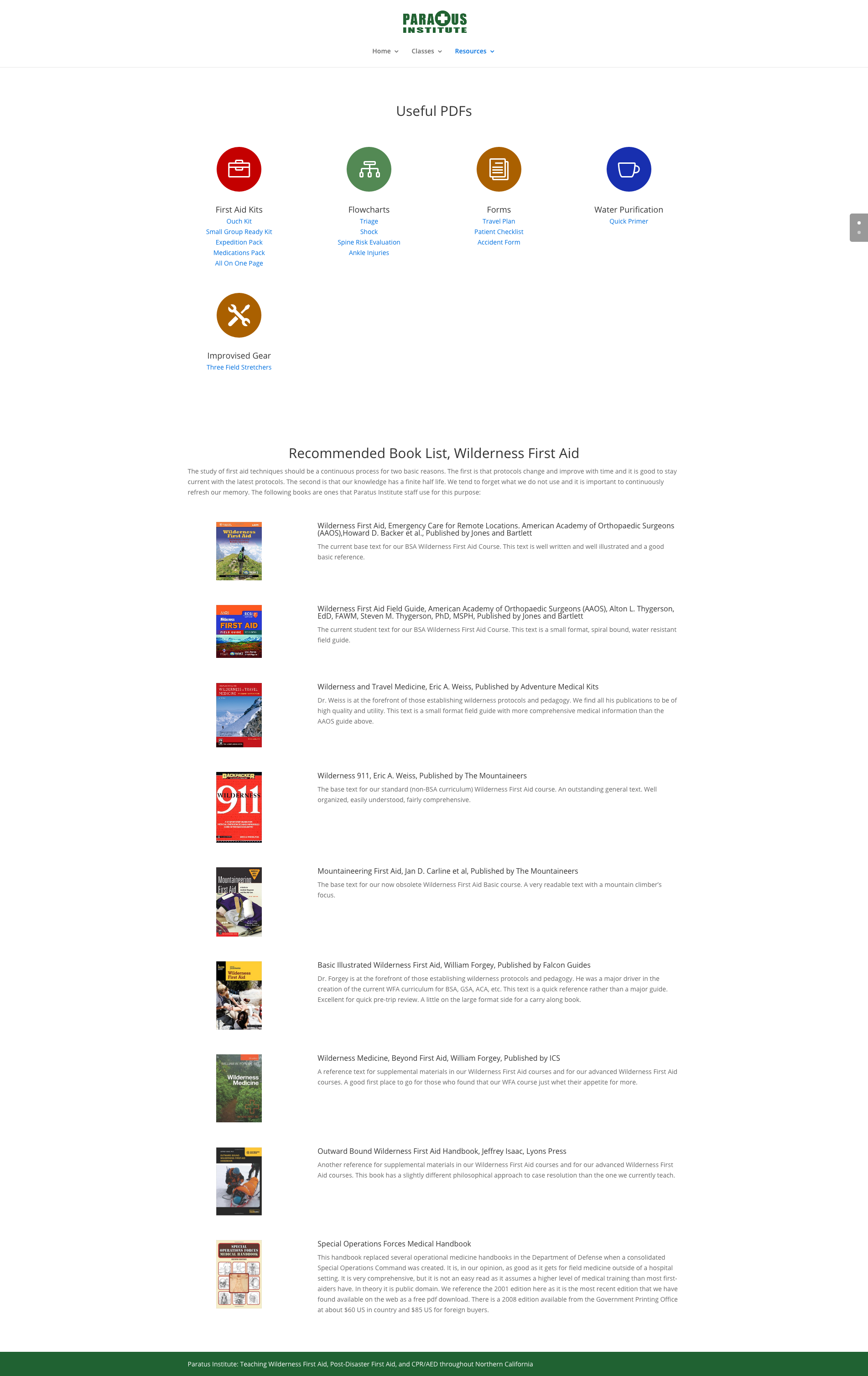
New Website
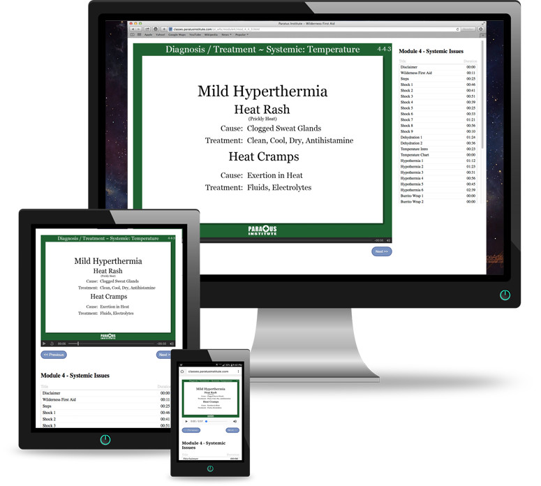
In keeping with Paratus’ commitment to being “available whenever, wherever, and however” the new design was a simple, responsive site that would work equally well on mobile, tablet, and desktop.
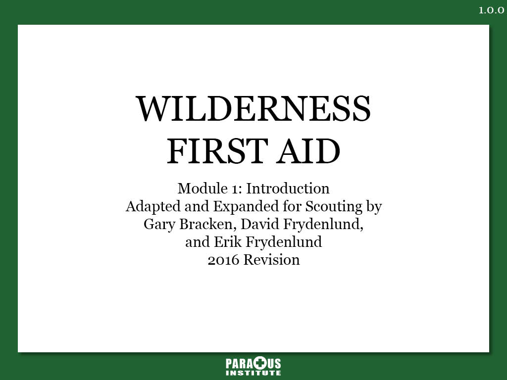
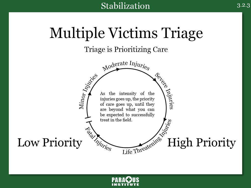
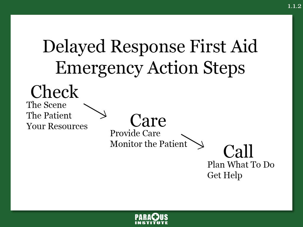
New Course Material Design
The overhaul of the course materials had three major parts:
1) Bring the class materials in line with Paratus’ new visual language. Incorporate brand colors, new logo, and cleaner layouts.
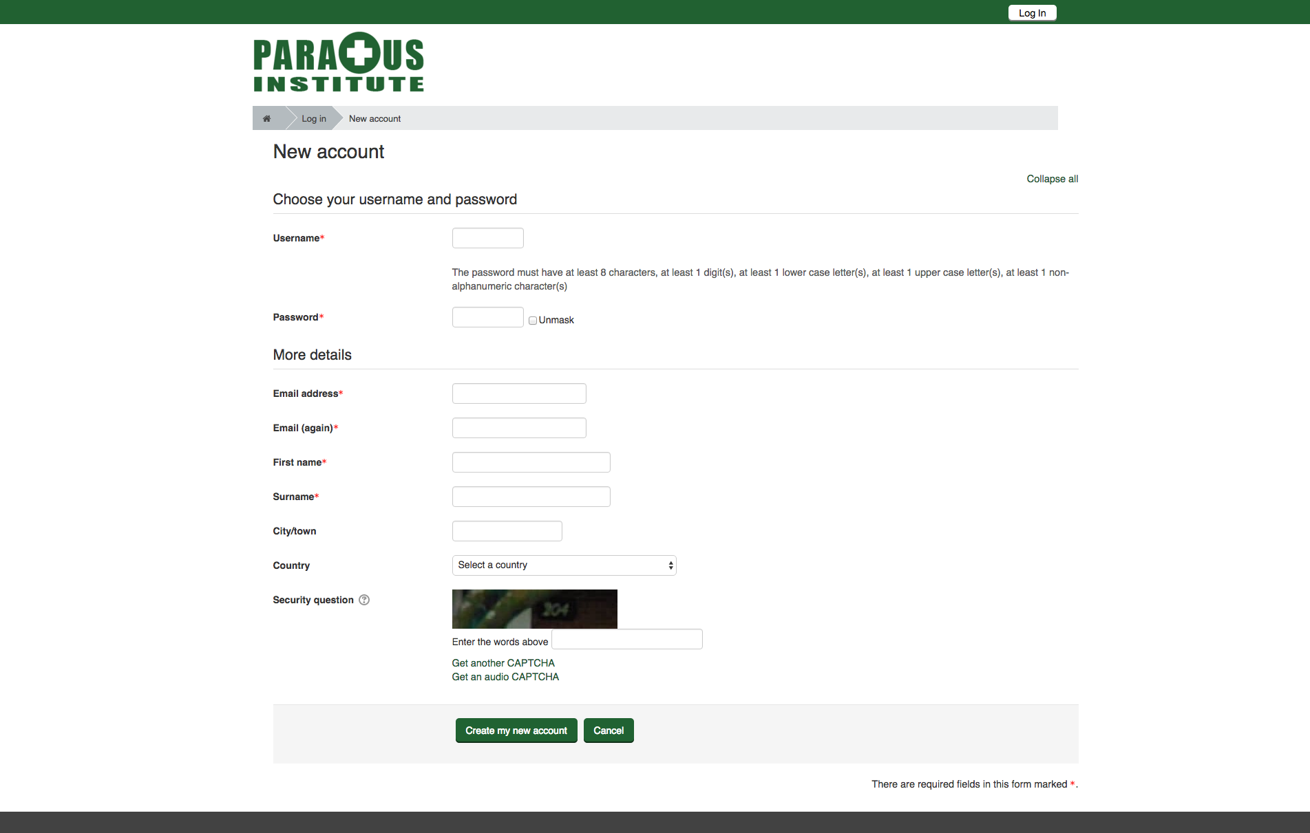
2) Upgrade Paratus Institute’s Course Management System to include a responsive design, on-brand visual language, and more modern features like integrated Paypal payments and simple, secure account authorization.
3) Migrate the company’s lecture materials from Adobe’s prebuilt solution to a custom one that relies on only browser agnostic technologies such as HTML5 video and audio.